Reality has its own reasonsHealthcare professionals are forever pressed for time. The greatest challenge they face each day is to quickly and accurately accomplish tasks and achieve their goals in the least possible time. Immediacy has always been the most defining trait of healthcare industry.
While a great deal of mobile applications promise to save time and embarrassment, Doctors often drop-off from using the apps after initial few attempts. This is because most app developers fail to integrate user experience into what is being dished out to their users. This includes factors like need, behavior, context of use and environmental implications.
WhiteCoats built the difference
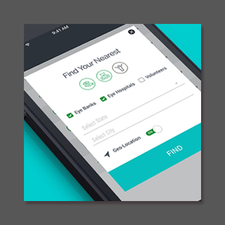
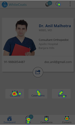
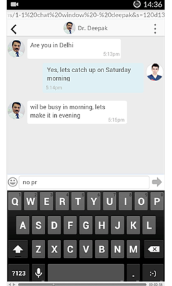
WhiteCoats is a mobile-based professional networking application developed exclusively for healthcare professionals such as doctors and paramedics. The app provides a digital engagement and collaboration platform enabling the users to be more effective and less stressed at work.
When we met the WhiteCoats team, conceptually everything seemed to be on the right track:Delivering the design differenceUnlike most application developers, who consider user experience as an after-thought, WhiteCoats wanted to proactively fuse the principles of user experience into the application early, hence approached Dotweb before the development stage. It was important to measure and analyze user behavior in real-time contexts and amidst the environmental factors.
Capturing the challengesDotWeb's UX engineers worked closely with WhiteCoats team to chart out the requirements. After an extensive research, data collection and UX audit of the application design (which included a quick Heuristic evaluation based recommendations), DotWeb’s team created a set of benchmarks against which the app could be tested for user experience.
After the recommendations were implemented, DotWeb’s team went ahead with usability testing directly with healthcare professionals.
Confronting with the mental modelDotWeb knew that the expert review (Heuristics) was just the beginning, not the end and the solutions on hand had to be tested against the mental model of the users.
The application had to be tested with actual users for real insights. This had to be reiterated so as to concretely validate the design decisions. To put it simply, the goal was to unearth problems, fill with solutions to make it efficient, usable and deliver a great experience to users.
Conducting usability testing with doctors of different specializations (as per the personas) under real-time scenarios and actual environmental conditions helped us to accurately pinpoint the factors that could hurdle the engagement and motivation of the users.
Redesigning for purposeAfter conducting usability testing with doctors, we came back with qualitative data, from live observations, recordings, heat maps and usability metrics like time-on-task, success rate etc.
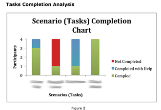
This qualitative data when analyzed led us to insights on key usability and experience issues.
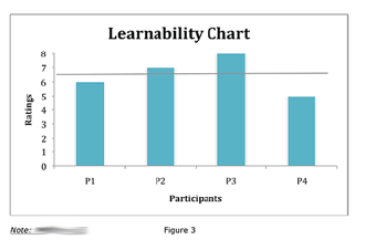
To prioritize and catalyze the change, DotWeb’s recommendations were categorized as:Changing, not correctingOur suggestions effected a change in the design and eventually, the application was released with enhanced usability, experience and acceptability. Suggestions also helped to improve the ‘Learnability’ and ‘Desirability’ thus reducing the friction between purpose and design.
Reality has its own reasonsHealthcare professionals are forever pressed for time. The greatest challenge they face each day is to quickly and accurately accomplish tasks and achieve their goals in the least possible time. Immediacy has always been the most defining trait of healthcare industry.
While a great deal of mobile applications promise to save time and embarrassment, Doctors often drop-off from using the apps after initial few attempts. This is because most app developers fail to integrate user experience into what is being dished out to their users. This includes factors like need, behavior, context of use and environmental implications.
WhiteCoats built the difference
WhiteCoats is a mobile-based professional networking application developed exclusively for healthcare professionals such as doctors and paramedics. The app provides a digital engagement and collaboration platform enabling the users to be more effective and less stressed at work.
When we met the WhiteCoats team, conceptually everything seemed to be on the right track:Delivering the design differenceUnlike most application developers, who consider user experience as an after-thought, WhiteCoats wanted to proactively fuse the principles of user experience into the application early, hence approached Dotweb before the development stage. It was important to measure and analyze user behavior in real-time contexts and amidst the environmental factors.
Capturing the challengesDotWeb's UX engineers worked closely with WhiteCoats team to chart out the requirements. After an extensive research, data collection and UX audit of the application design (which included a quick Heuristic evaluation based recommendations), DotWeb’s team created a set of benchmarks against which the app could be tested for user experience.
After the recommendations were implemented, DotWeb’s team went ahead with usability testing directly with healthcare professionals.
Confronting with the mental modelDotWeb knew that the expert review (Heuristics) was just the beginning, not the end and the solutions on hand had to be tested against the mental model of the users.
The application had to be tested with actual users for real insights. This had to be reiterated so as to concretely validate the design decisions. To put it simply, the goal was to unearth problems, fill with solutions to make it efficient, usable and deliver a great experience to users.
Conducting usability testing with doctors of different specializations (as per the personas) under real-time scenarios and actual environmental conditions helped us to accurately pinpoint the factors that could hurdle the engagement and motivation of the users.
Redesigning for purposeAfter conducting usability testing with doctors, we came back with qualitative data, from live observations, recordings, heat maps and usability metrics like time-on-task, success rate etc.
This qualitative data when analyzed led us to insights on key usability and experience issues.
To prioritize and catalyze the change, DotWeb’s recommendations were categorized as:Changing, not correctingOur suggestions effected a change in the design and eventually, the application was released with enhanced usability, experience and acceptability. Suggestions also helped to improve the ‘Learnability’ and ‘Desirability’ thus reducing the friction between purpose and design.
We’d love To Meet You In Person Or Via The Web!